Essential guides
Applying the Scandlearn colour palette
The Scandlearn colours are a core part of our visual identity. This guide explains how to use them effectively to create a unified and engaging look across all materials. Consistent colour application helps our brand stand out and feel instantly familiar.
16-10-25
![]() |
Christopher D'Esposito, Graphic Designer |
Our brand colours are more than decoration—they’re a visual shorthand for who we are and what we stand for. When used consistently, they strengthen recognition, create emotional connection, and communicate our brand’s personality across every channel, from social platforms to our courseware. This guide will show you how to apply our colour palette with clarity and consistency so that every design looks and feels unmistakably ours.

The Brand Colour Palette
Our colour palette is the foundation of our visual identity. It’s designed to be flexible yet distinctive, ensuring our brand always feels cohesive across every medium. The primary colours are our most recognizable tones—they should dominate most applications and instantly signal who we are. Secondary colours provide additional depth and variety, supporting the primary blue. Accent and background colours provide function and flexibility, helping guide focus or provide opportunities for inversed layouts.

Use the palette proportionally: think of primary colours as the “voice,” secondary as the “supporting tone,” and accents as “punctuation.” Always refer to the provided colour codes to maintain consistency across all outputs.
Utility colours such as red, orange, and green are reserved for functional communication—highlighting critical information, warnings, or success states within our content. They are not part of our brand identity but serve to improve user experience and comprehension.
Colour Psychology and Brand Expression
Our colour palette balances authority and innovation, reflecting both the professionalism of aviation and the creativity of modern digital learning. Deep navy tones
#1F285B, #1C2350, #0D132Bconvey trust, competence, and technical precision—qualities that define our industry and our approach to training. The bold yellow #FDDC00 brings contrast and vitality, symbolising energy, curiosity, and the pursuit of knowledge that drives our ed-tech mission.Core Elements Kit
Supporting blues
#145FAD, #0996FF extend this confident, contemporary feel across our interfaces and course materials, ensuring a clean and cohesive presence. Neutral backgrounds and greys maintain clarity and professionalism for inverse layouts, allowing our key colours to stand out while ensuring readability.Together, these colours express who we are: a trusted, modern partner in aviation learning—sharp, confident, and always forward-looking.
Usage Guidelines
Consistent application of our colours ensures that every visual feels cohesive, credible, and unmistakably part of the Scandlearn brand. The primary blue
#1F285B should dominate most branded materials. Navy provides structure and professionalism; the yellow #FDDC00 steps in to add some vibrancy and emphasis. Use them in proportion, with navy as the anchor and yellow as an accent for highlights, calls to action, and visual energy.Secondary colours—our supporting blues and light neutrals—can be used to build depth, backgrounds, and variation in layouts while keeping the focus on the primary palette. Accent blues like
#0996FF work well for highlights or interface elements that require contrast without overpowering the primary tones.Utility colours—red
#F64E4E, orange #F26B21, and green #2AD46E—should appear only in functional contexts such as alerts, warnings, or status indicators. These colours enhance comprehension but are not part of our visual identity and should never be used decoratively.Maintain strong contrast and legibility at all times, especially when combining yellow with dark backgrounds or blue with light tones. Avoid using colours in unintended tints or transparencies that may dilute recognition.
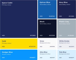
Colour is one of the most immediate ways our brand communicates who we are. By applying our palette with intention and consistency, every design—whether a course interface, presentation, or marketing piece—contributes to a cohesive visual story of trust, innovation, and clarity. Our colours are not just aesthetic choices; they express our commitment to professional excellence and engaging, forward-thinking learning experiences for the aviation industry.
As you create, keep the balance between structure and creativity in mind: use the palette as your foundation, then bring it to life through thoughtful design. For questions, approvals, or access to official assets, please reach out to the brand or marketing team. Together, we’ll ensure our visuals remain as confident and dynamic as the professionals we serve.
![]() |
Christopher D'Esposito, Graphic Designer |
All rights reserved
