Building structure into every page
Behind every polished course page lies a dependable framework — our grid and layout system. It’s the invisible structure that keeps our pages organized, balanced, and consistent, giving our design team a fast, reliable way to build new layouts without having to rethink every page design from scratch.
24-10-25
 |
Christopher D'Esposito, Graphic Designer |


The role of the grid
A well-designed grid brings order and efficiency to the creative process. It defines where elements belong, how they relate to one another, and how the page feels as a whole.
For our team, that structure translates to swifter output and designing confidence.
The benefits of a grid system
-
Faster builds: Pages can be assembled quickly using a predictable framework.
-
Less guesswork: The grid helps solve alignment and spacing challenges.
-
More creative freedom: Designers can focus on storytelling and visual impact instead of constant layout refinement.
In short, the grid gives us a shared foundation that removes the tedious parts of layout work — so we can spend more time designing content that connects.
Our core grid structure
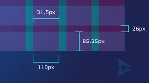
In addition to our safe areas, the grid system defines the main structural rhythm of each course page. It provides consistent proportions that work beautifully across devices, allowing flexibility without sacrificing visual order.

Grid Specifications
-
12 columns, each 110 px wide
-
31.5 px gutter between columns
-
7 rows, each 85.25 px high
-
26 px gutter between rows
These measurements create a balanced and modular framework that makes building new layouts straightforward and repeatable.
Download the grid system files and layout templates now
Creating layouts from the grid
Using the grid as a guide, designers can quickly define page layouts by zoning out specific content areas — headers, text blocks, charts, graphs, isolated artwork and more.


Above shows how simple balanced layouts can be achieved quickly by zoning or blocking out areas of the page using the grid system.
This method offers three major benefits:
-
Efficiency: Designers can block out pages in moments using the grid as a guide.
-
Consistency: Elements align naturally, maintaining a cohesive look across the entire course library.
-
Scalability: Once a layout works well, it can be reused or adapted easily for future pages.
By relying on these predefined zones, our creatives can focus on crafting strong content and visual storytelling — instead of getting lost in endless spacing and alignment decisions.


Above shows how simple balanced layouts can be achieved quickly by zoning or blocking out areas of the page using the grid system.
Consistency through design systems
As our Design System continues to evolve, new ready-made layouts will be added to the toolkit — each one built on the same grid principles. This means:
-
Less time starting from a blank page.
-
More confidence that every design fits within our brand standards.
-
A growing library of templates that simplify production and promote visual unity.
Over time, this shared system will help every designer — from new hires to seasoned creatives — work faster, stay consistent, and keep their focus on creativity, not structure.


Blocking progressive shots will be a simple matter with the grid system, as a page seamlessly transitions from one layout to another.
A framework for focused creativity
Our grid and layout system is more than a set of measurements — it’s a framework that makes design easier, faster, and more consistent.
It gives structure to our creativity, ensures brand alignment, and removes unnecessary layout friction.
By building from this shared framework, we save time, strengthen visual unity, and empower our creatives to focus on what matters most: delivering exceptional learning experiences that look and feel effortless.
 |
Christopher D'Esposito, Graphic Designer |


